


Launched 3rd May 2018.
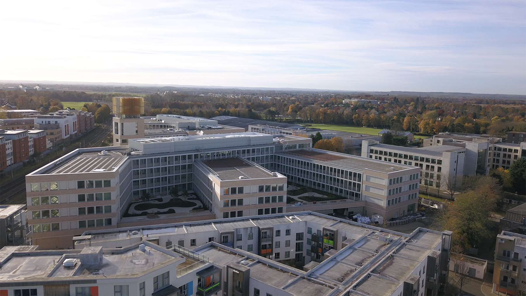
Phaophanit and Oboussier were the competition winners to create a site responsive artwork in collaboration with Eric Parry Architects for their new Cambridge Assessment HQ Building at Cambridge University, UK.
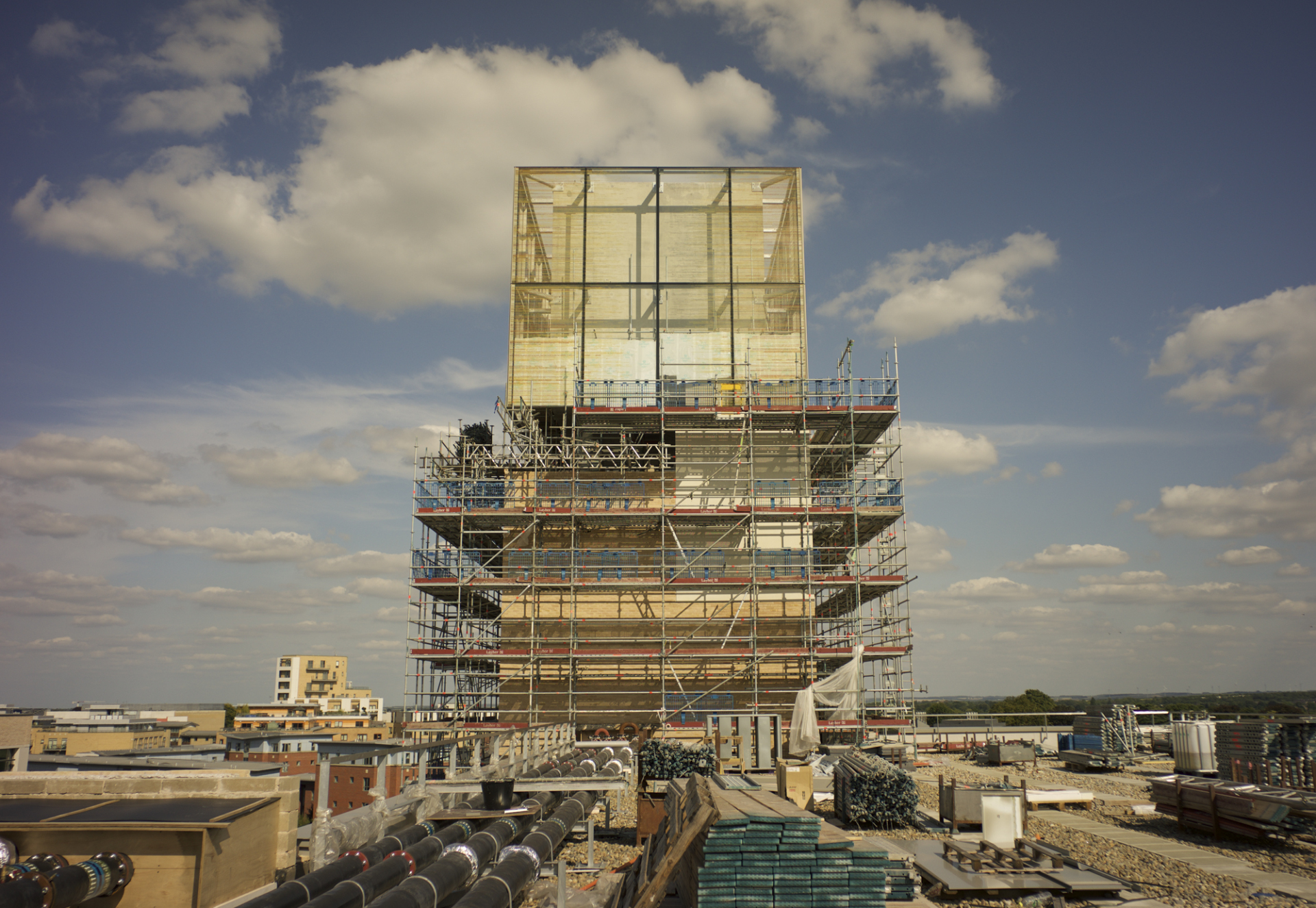
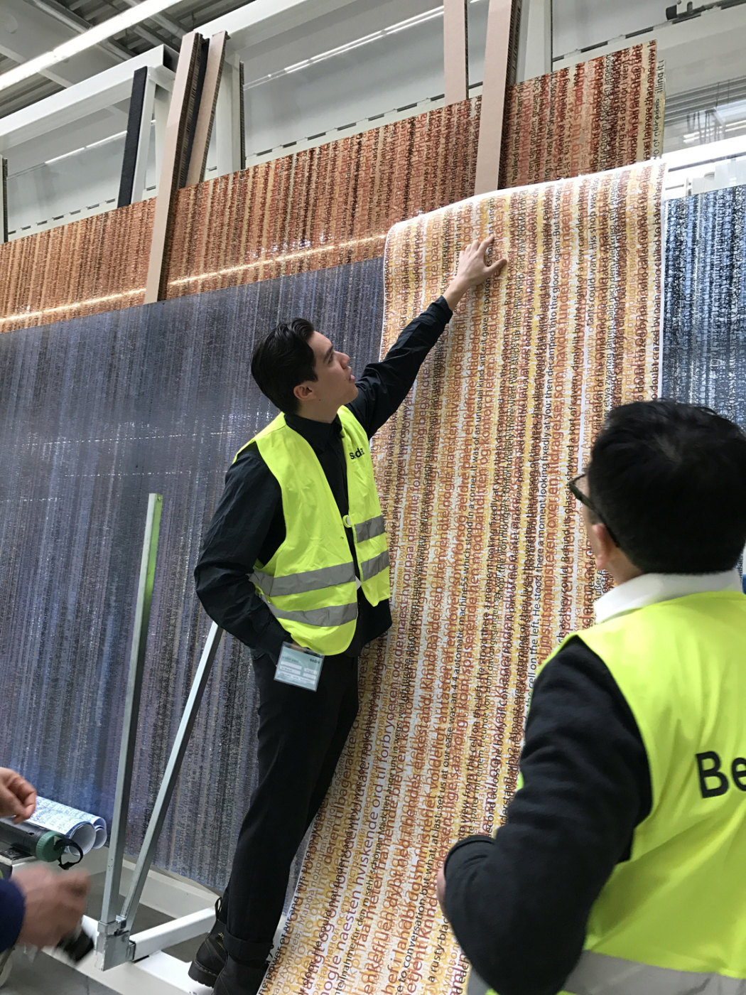
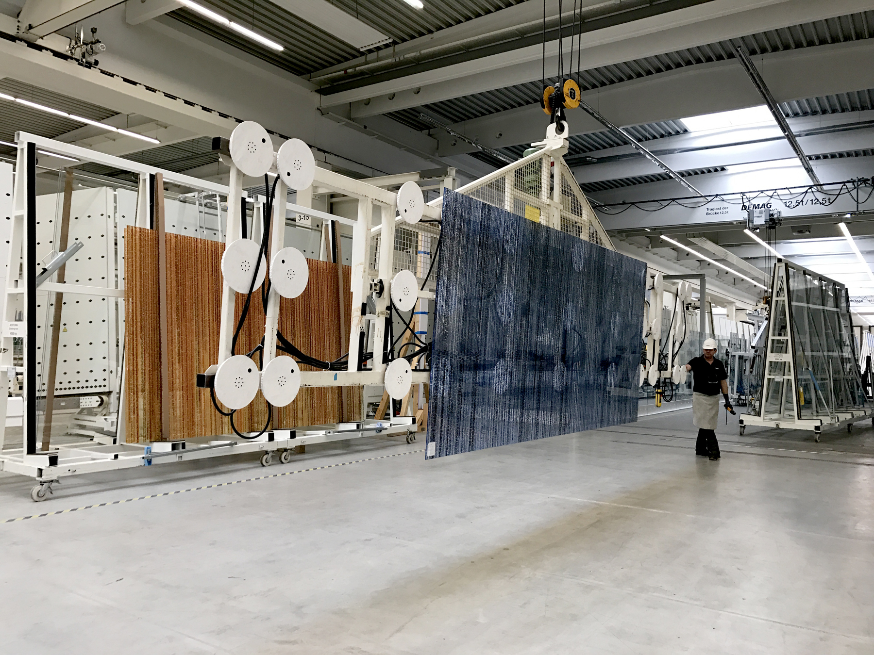
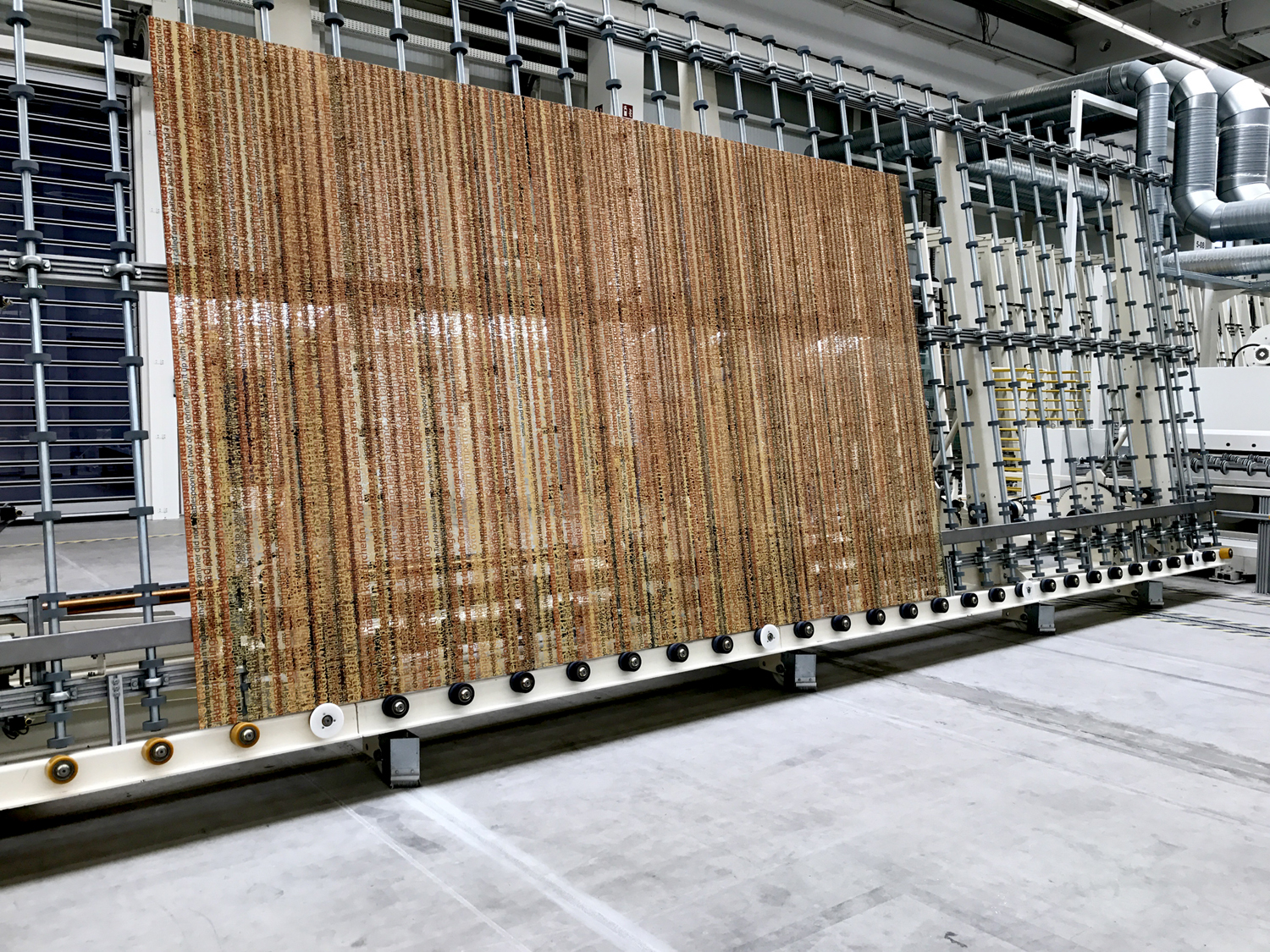
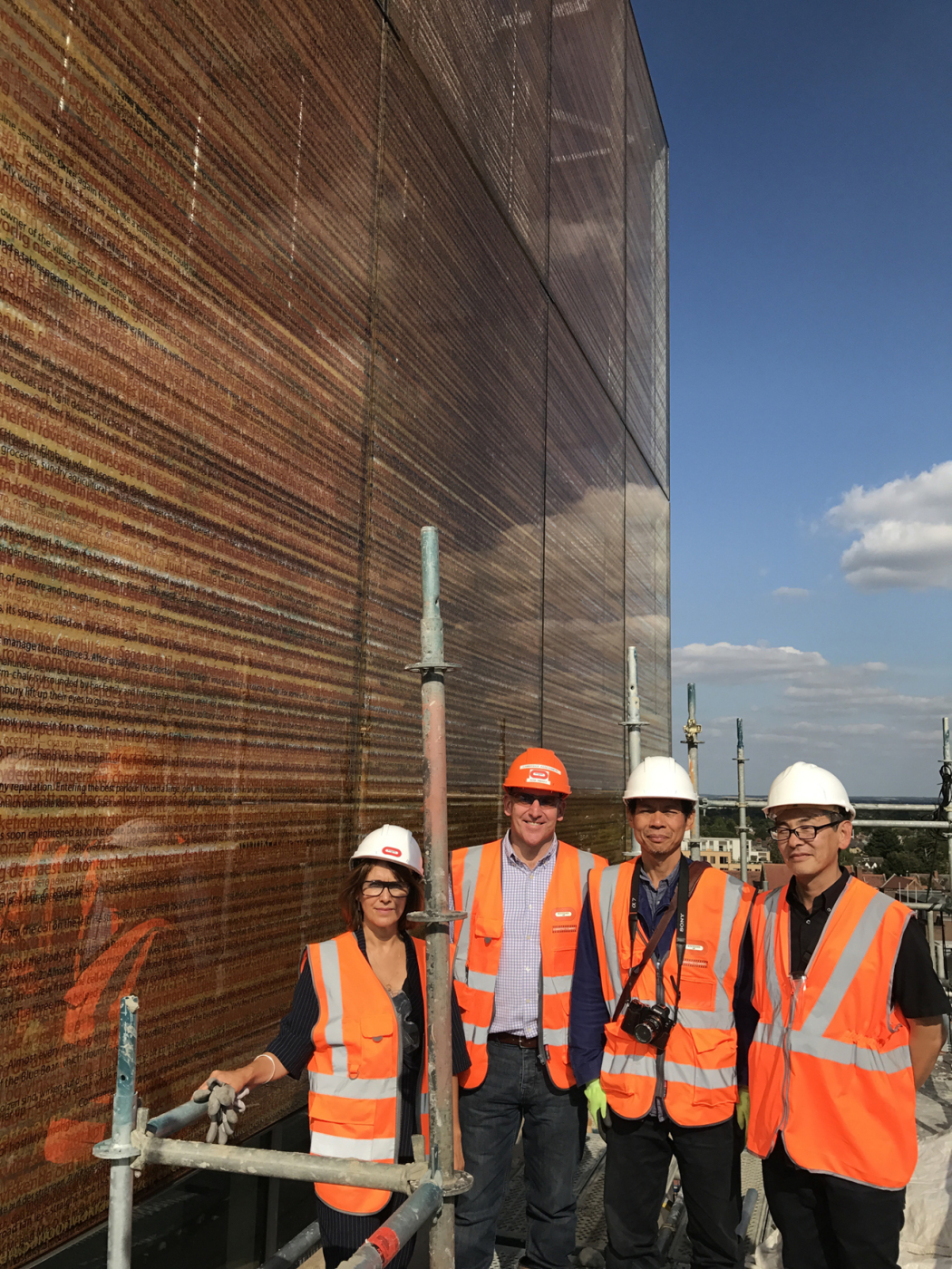
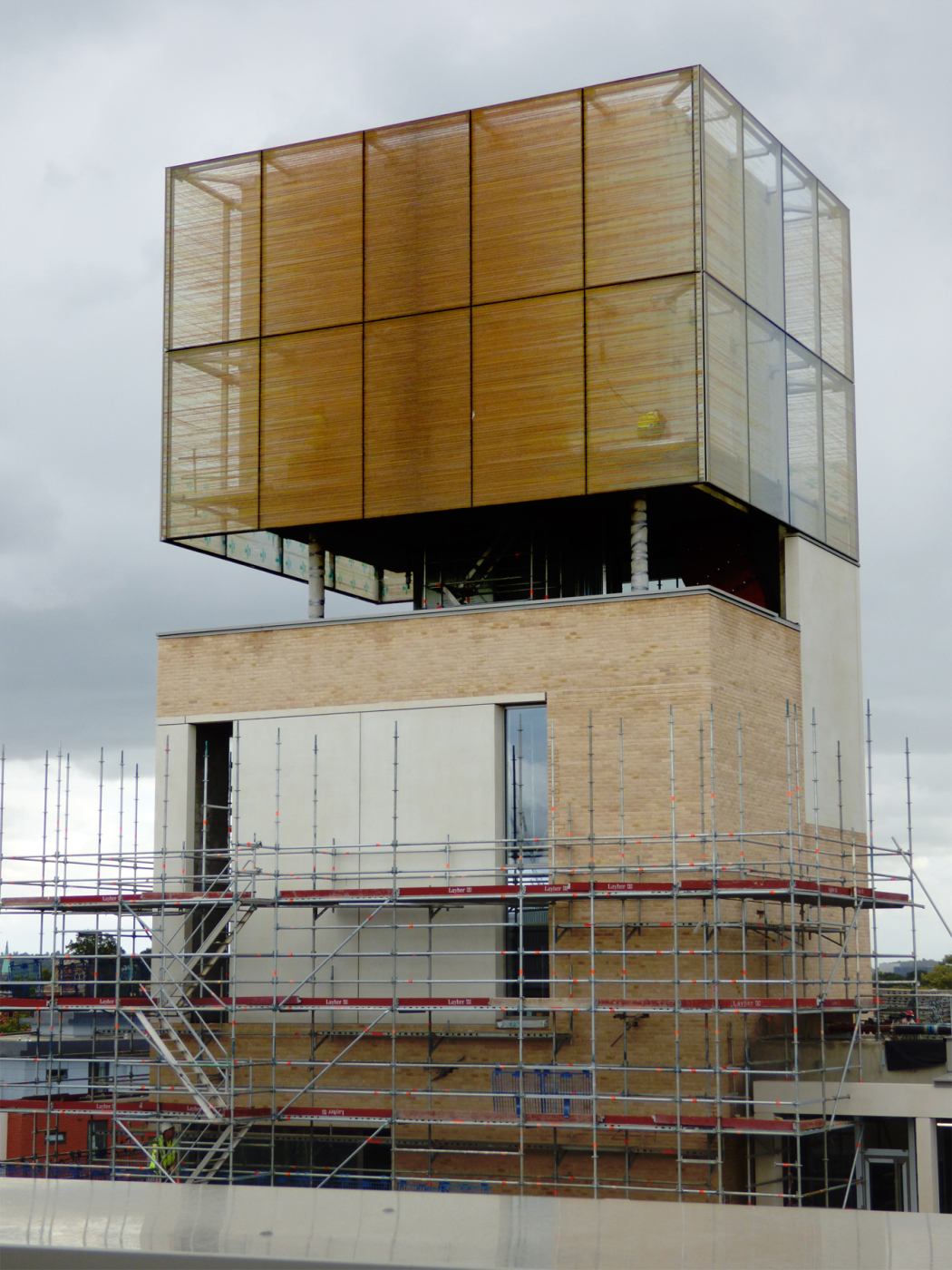
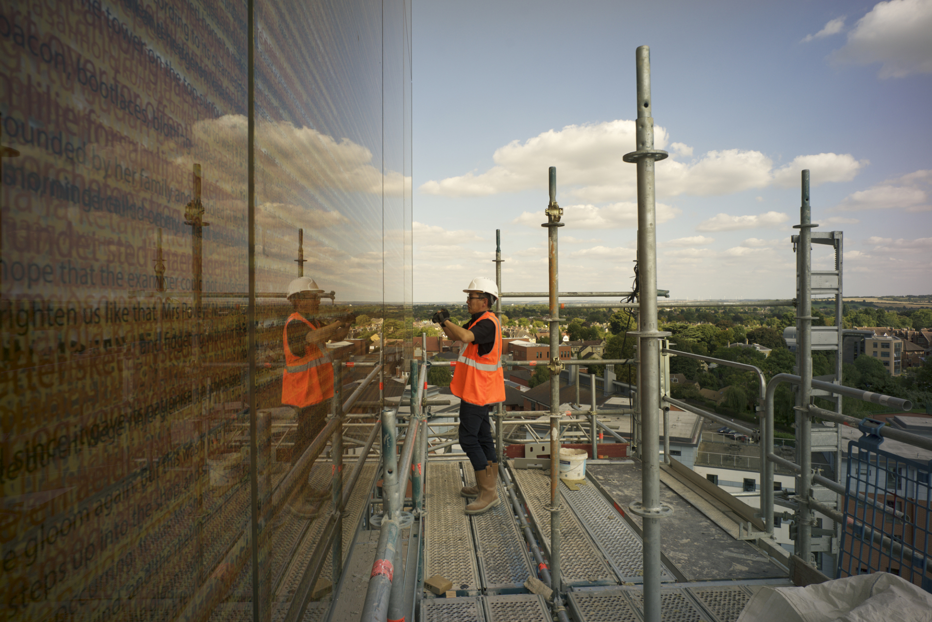
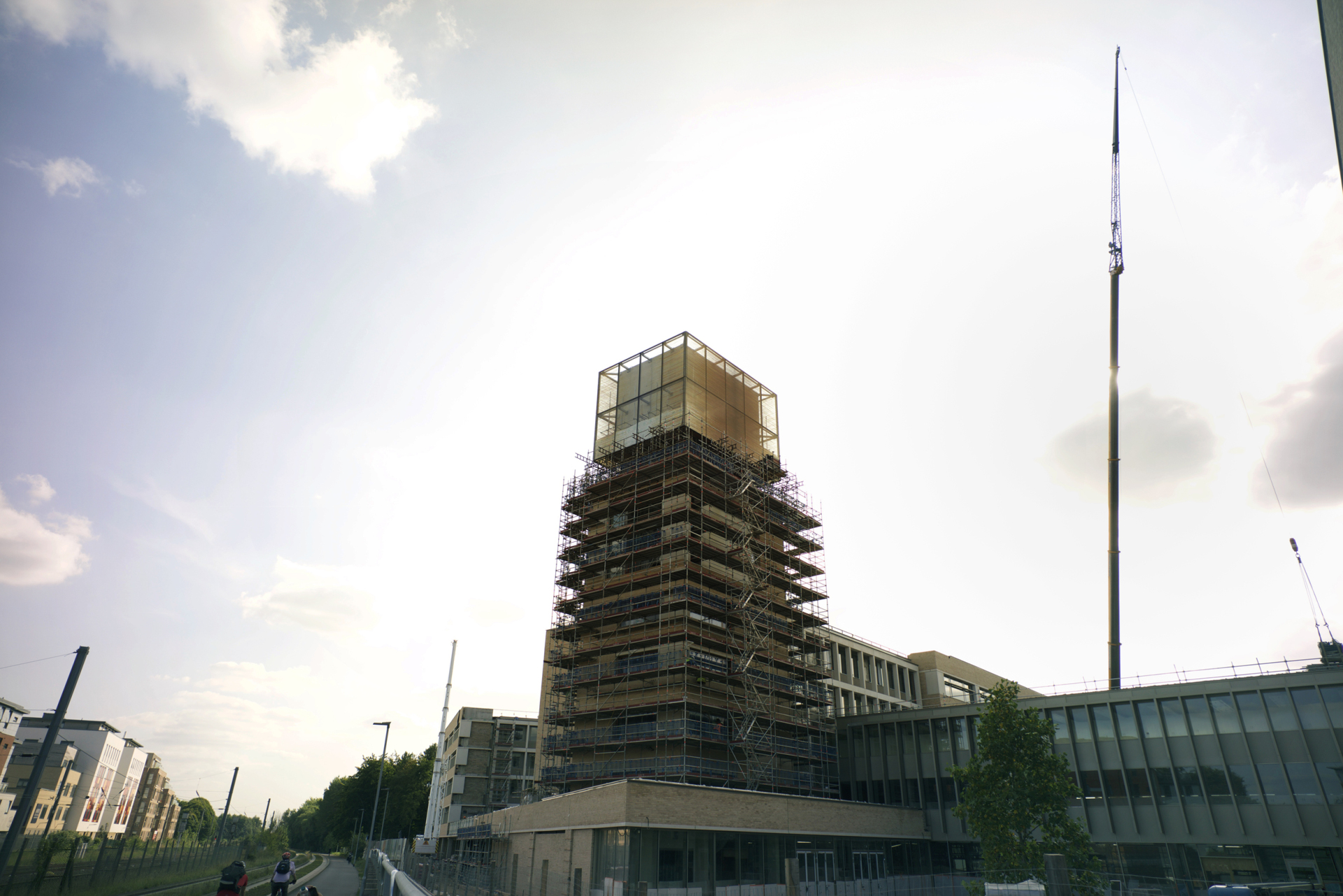
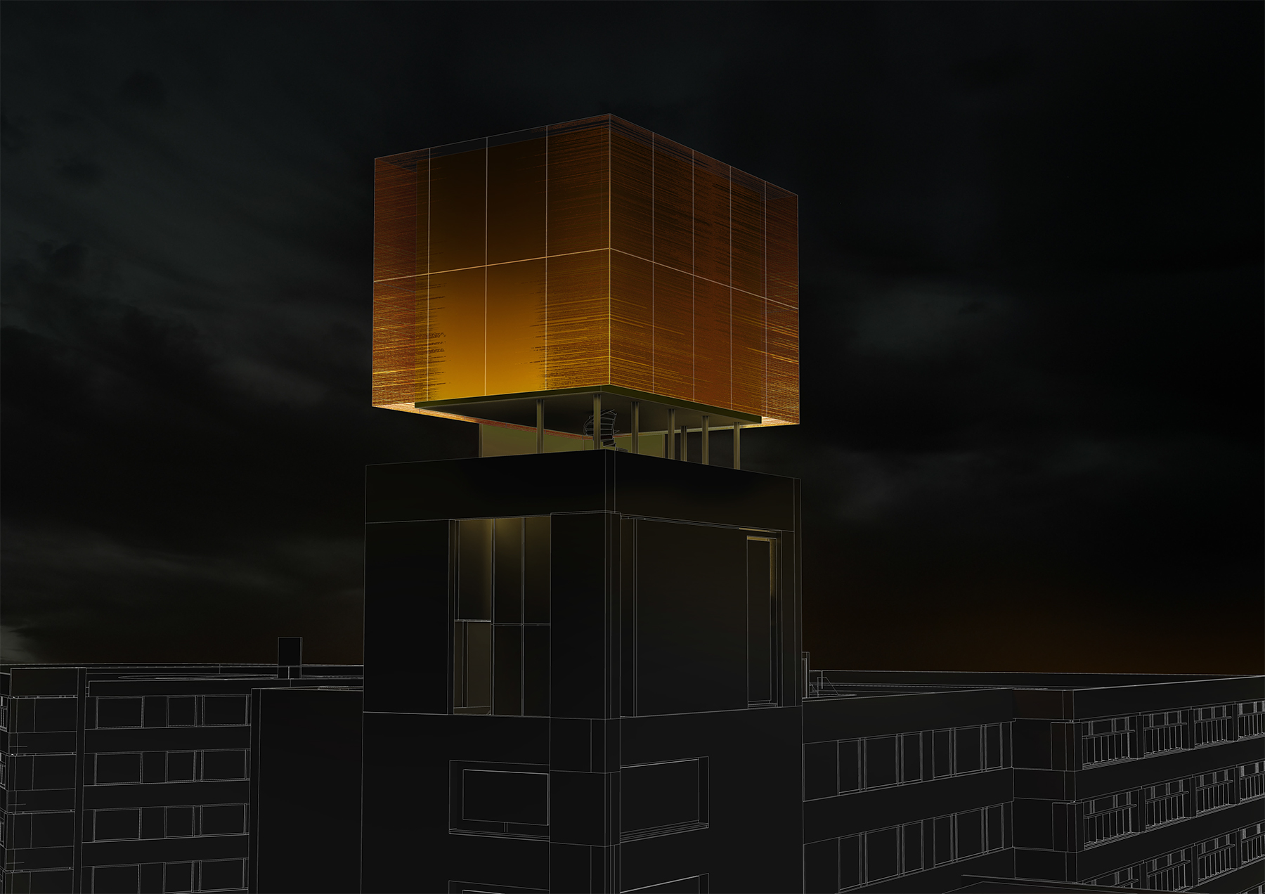
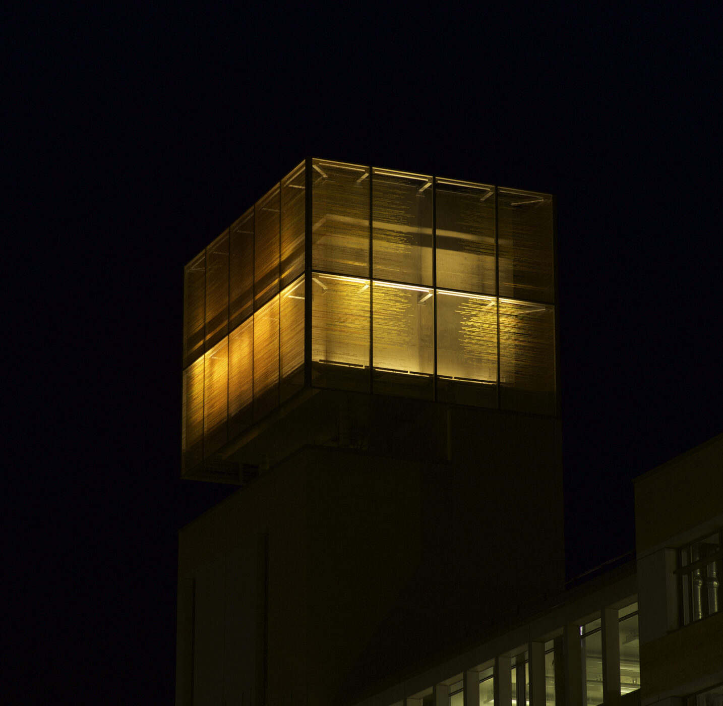
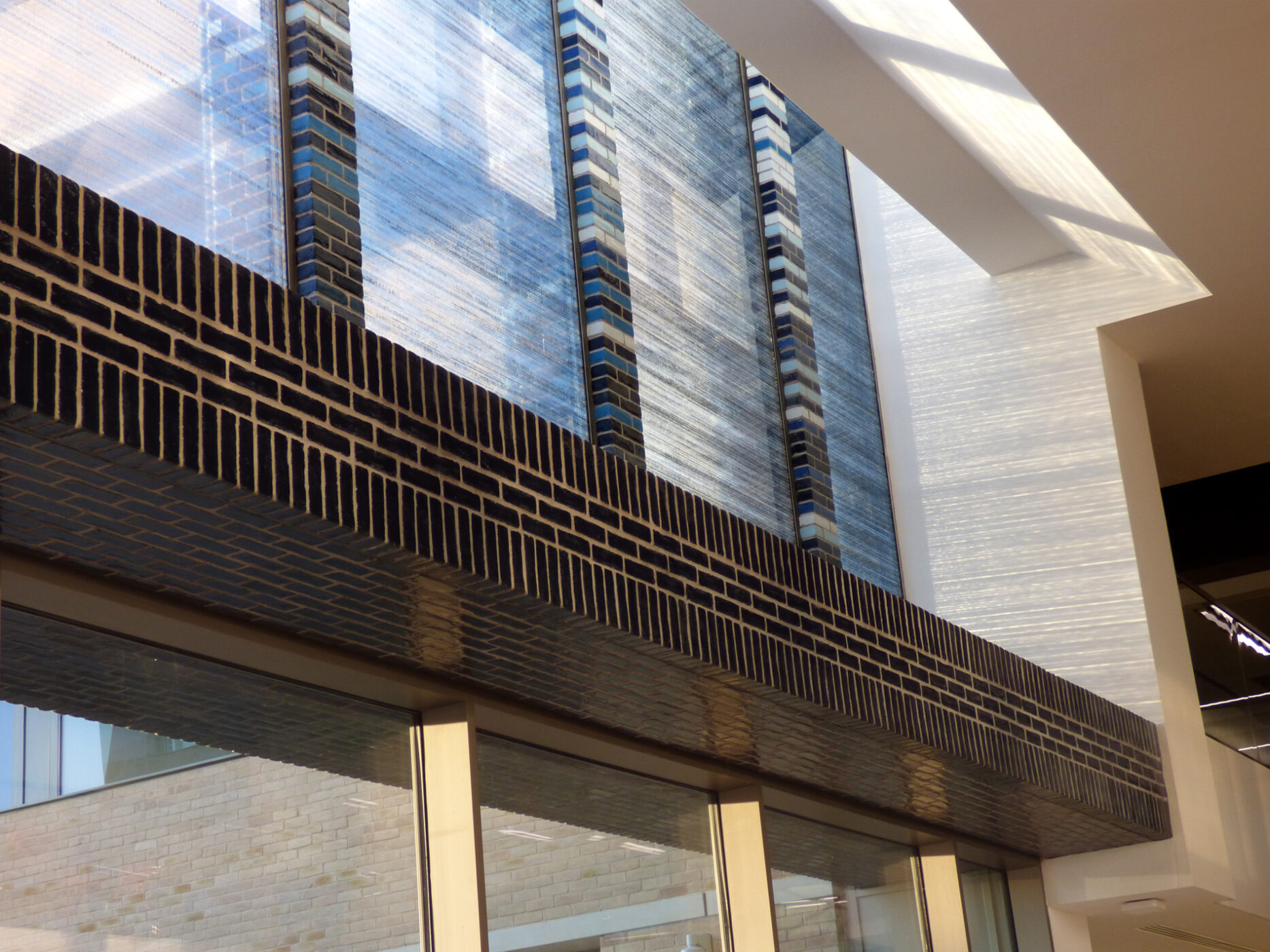
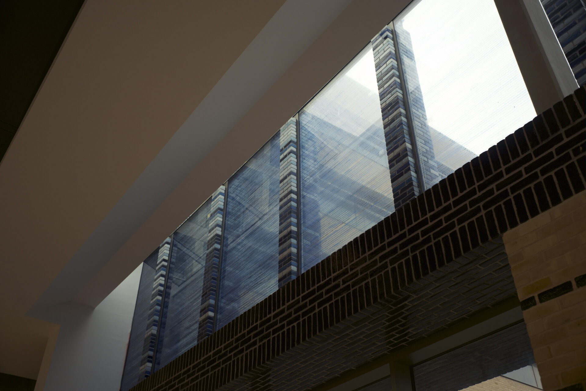
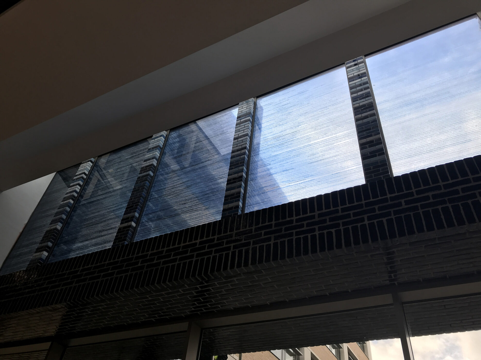
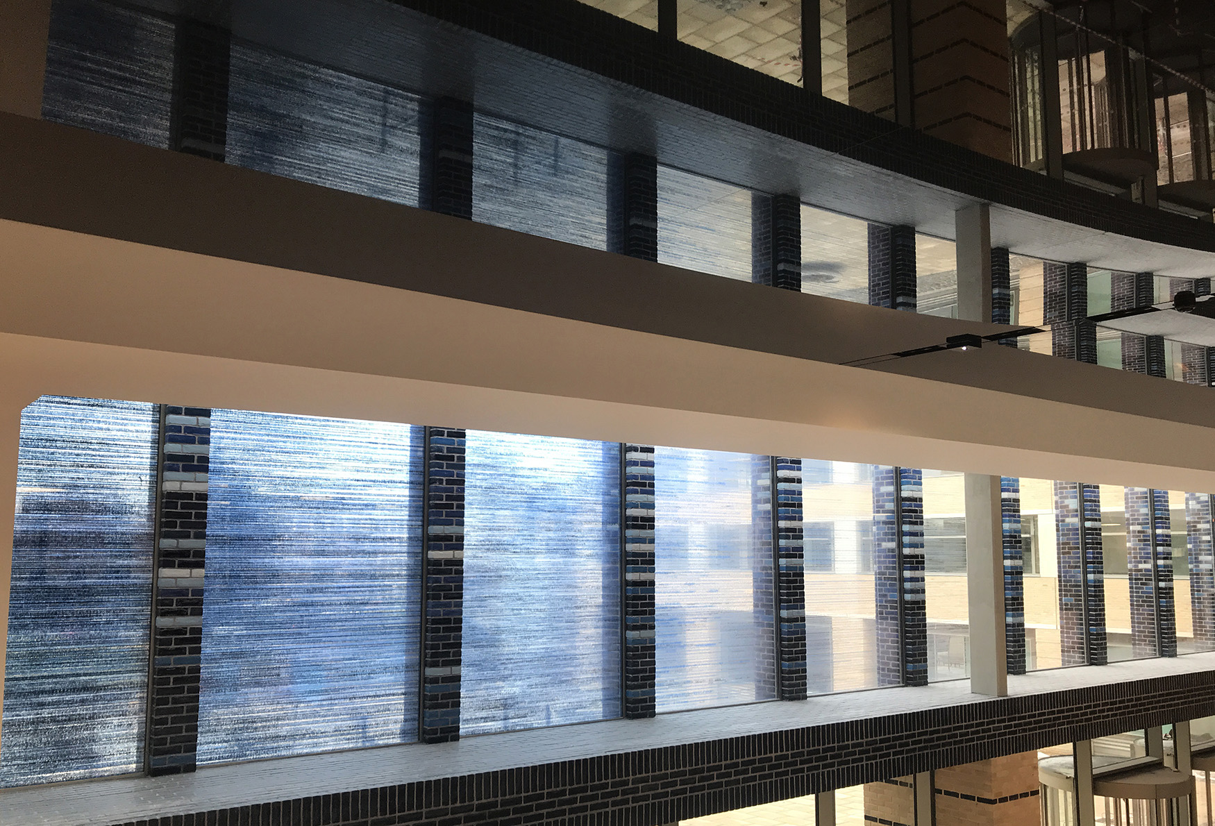
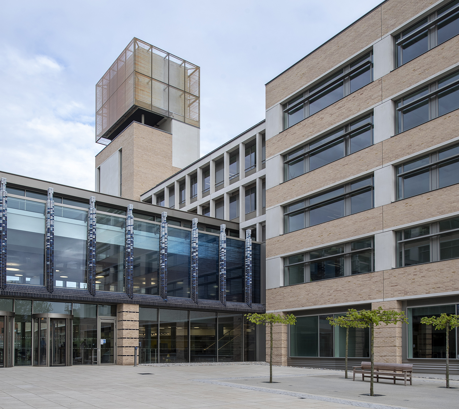
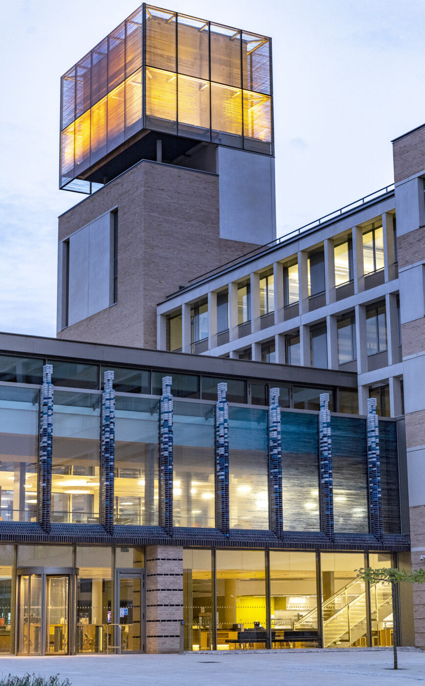
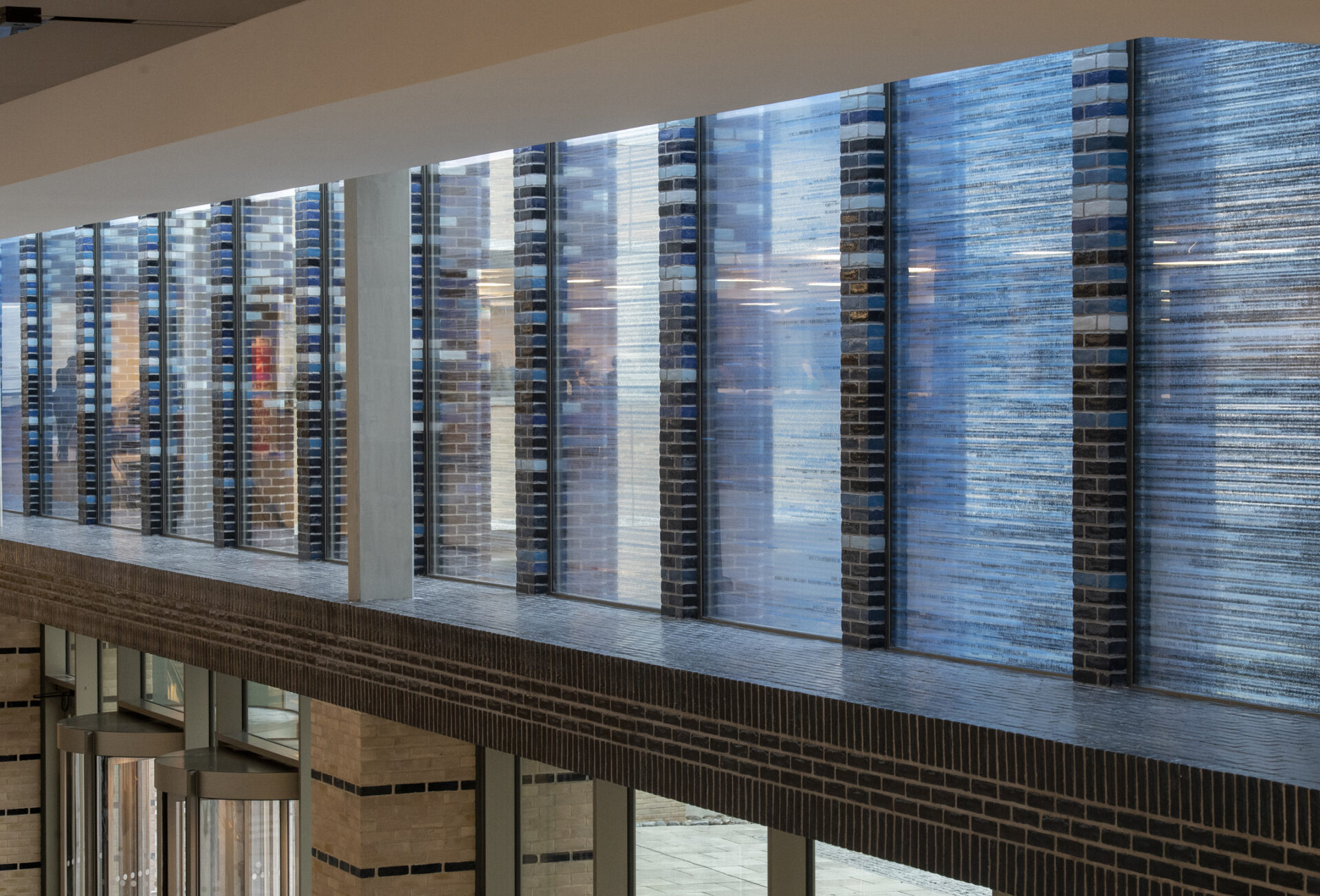
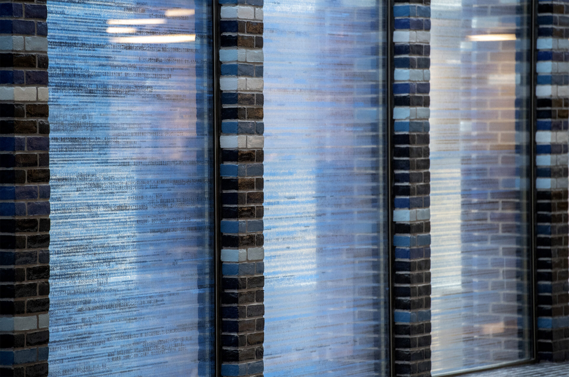
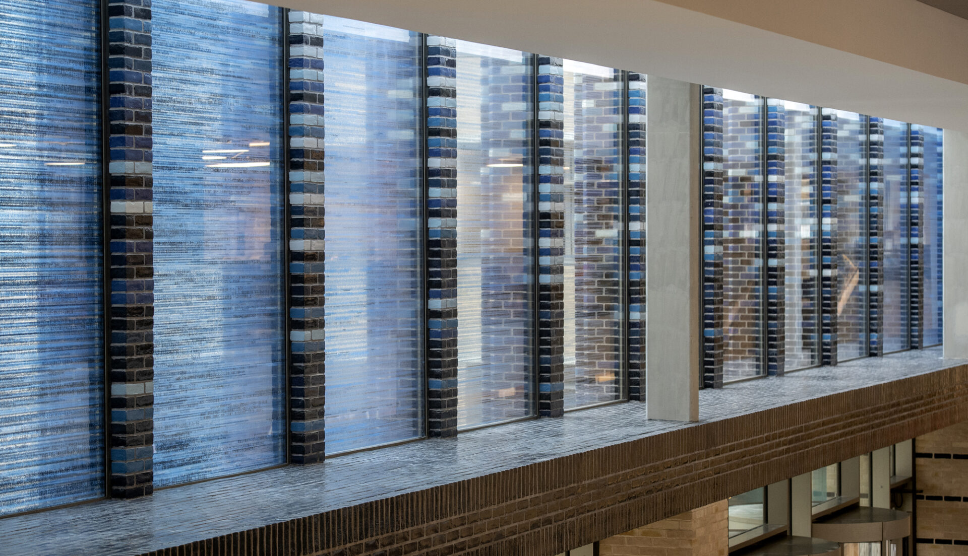
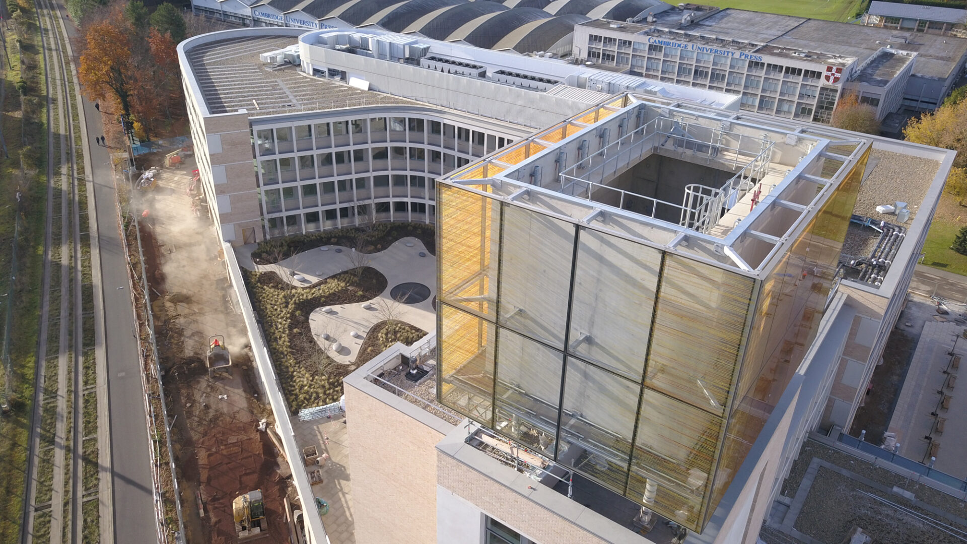
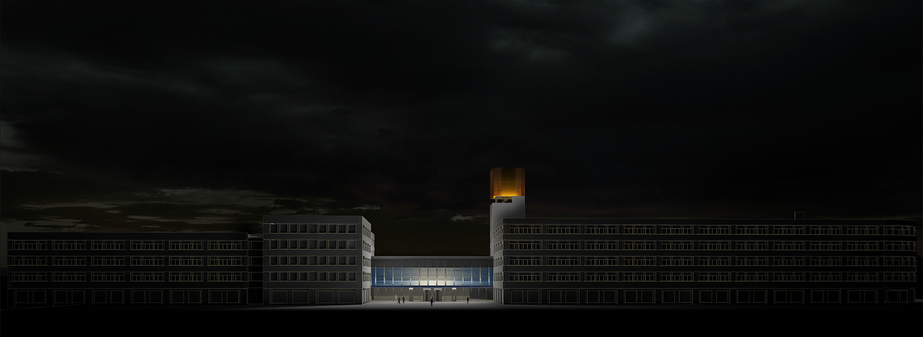
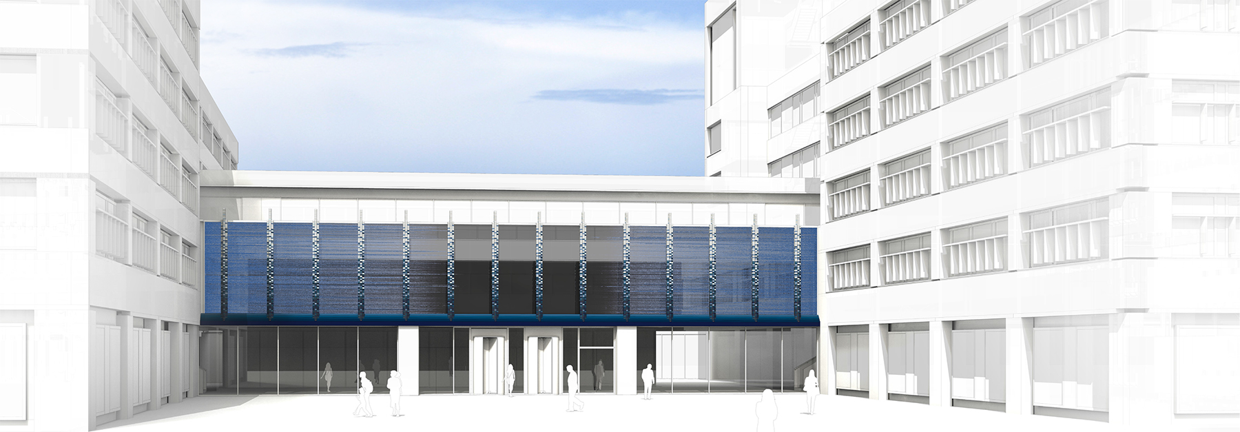
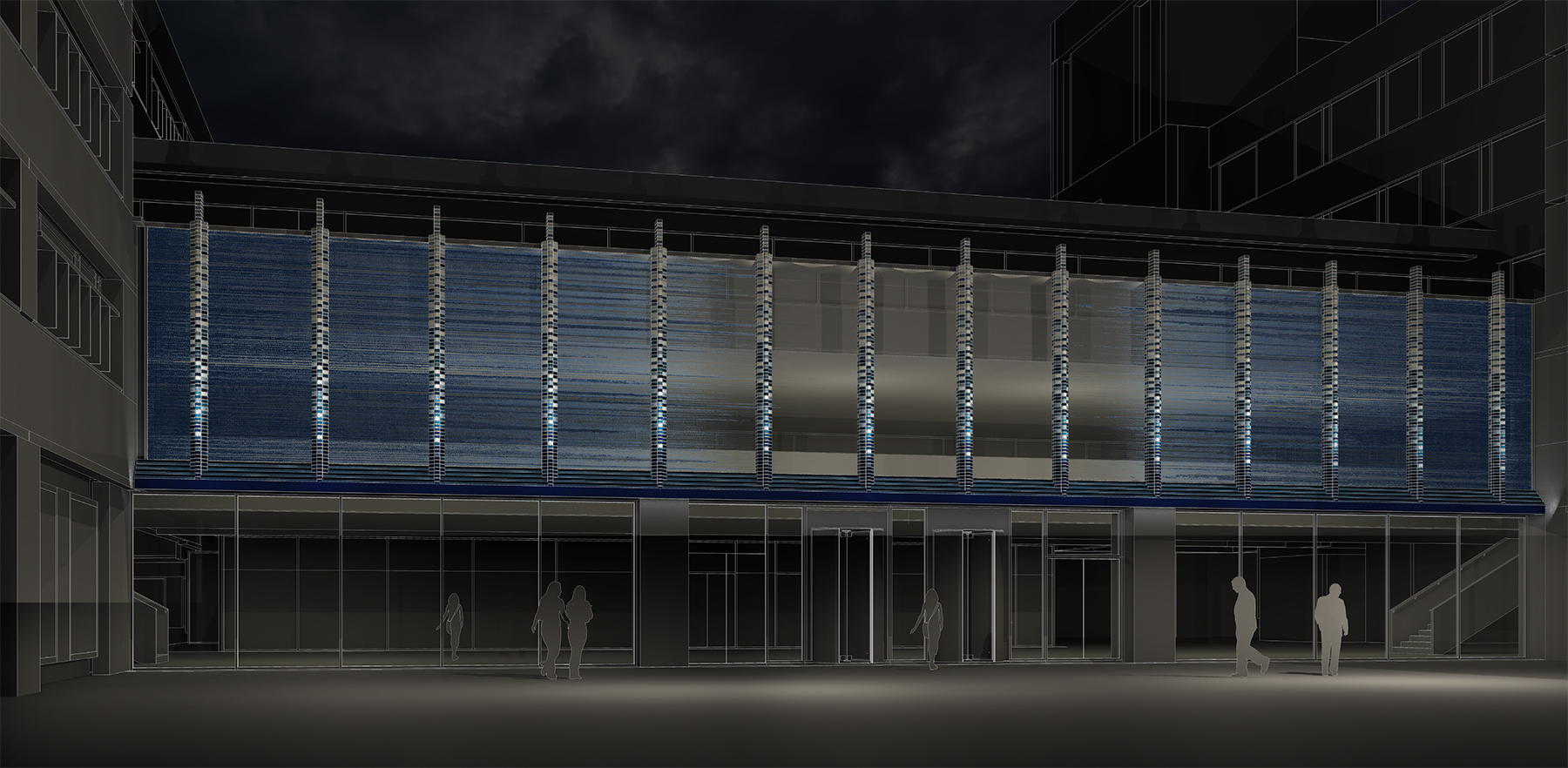
In Other Words is a twin piece that comprises two ceramic printed glass works – one for the ‘link’ façade of the building and the other for the tower.
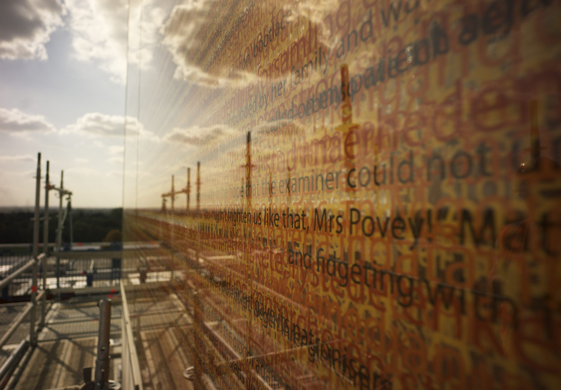
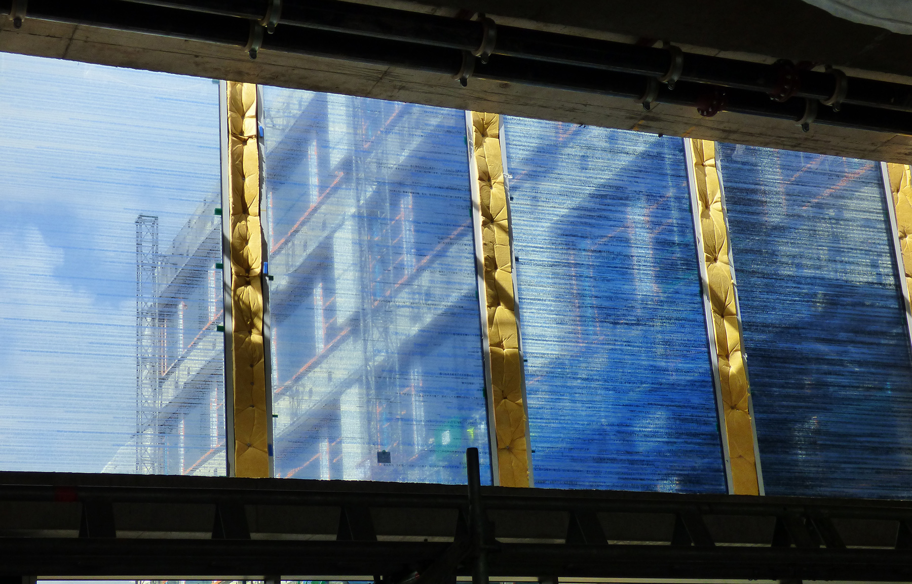
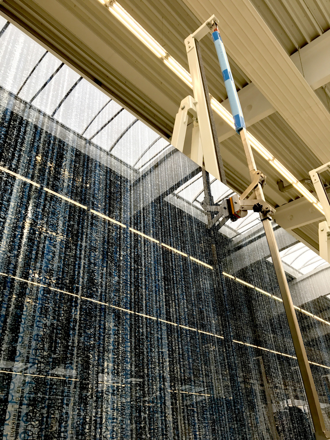
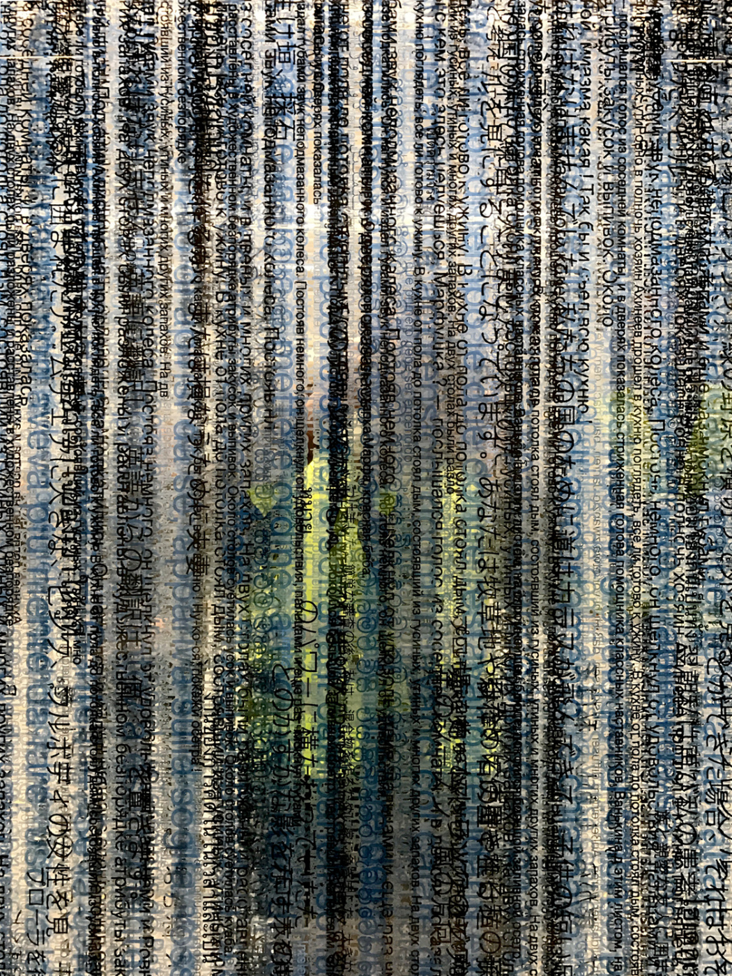
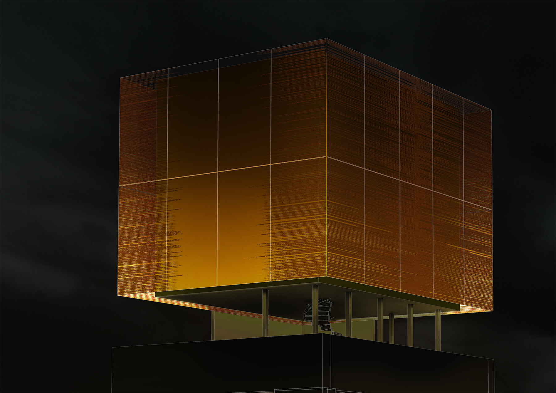
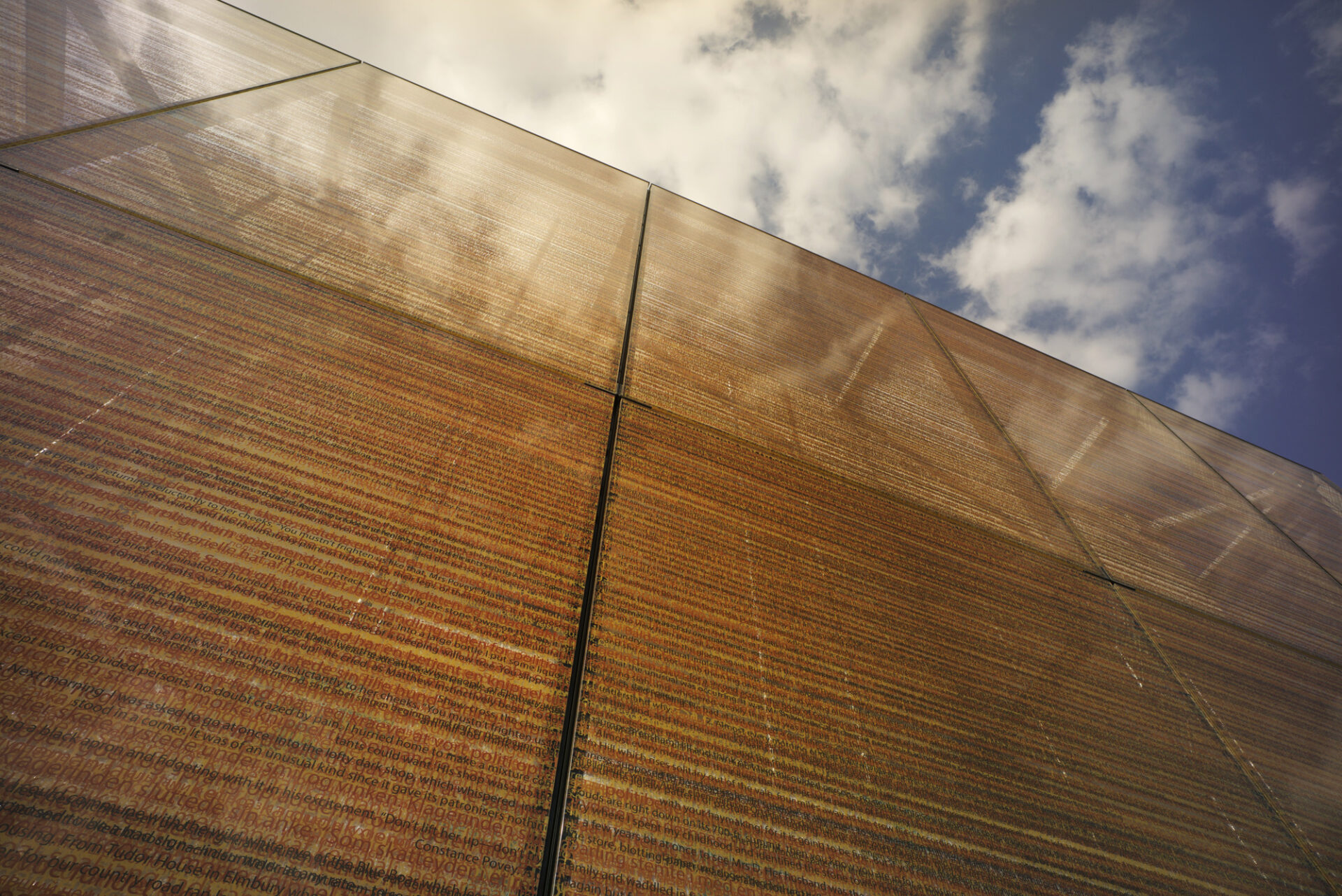
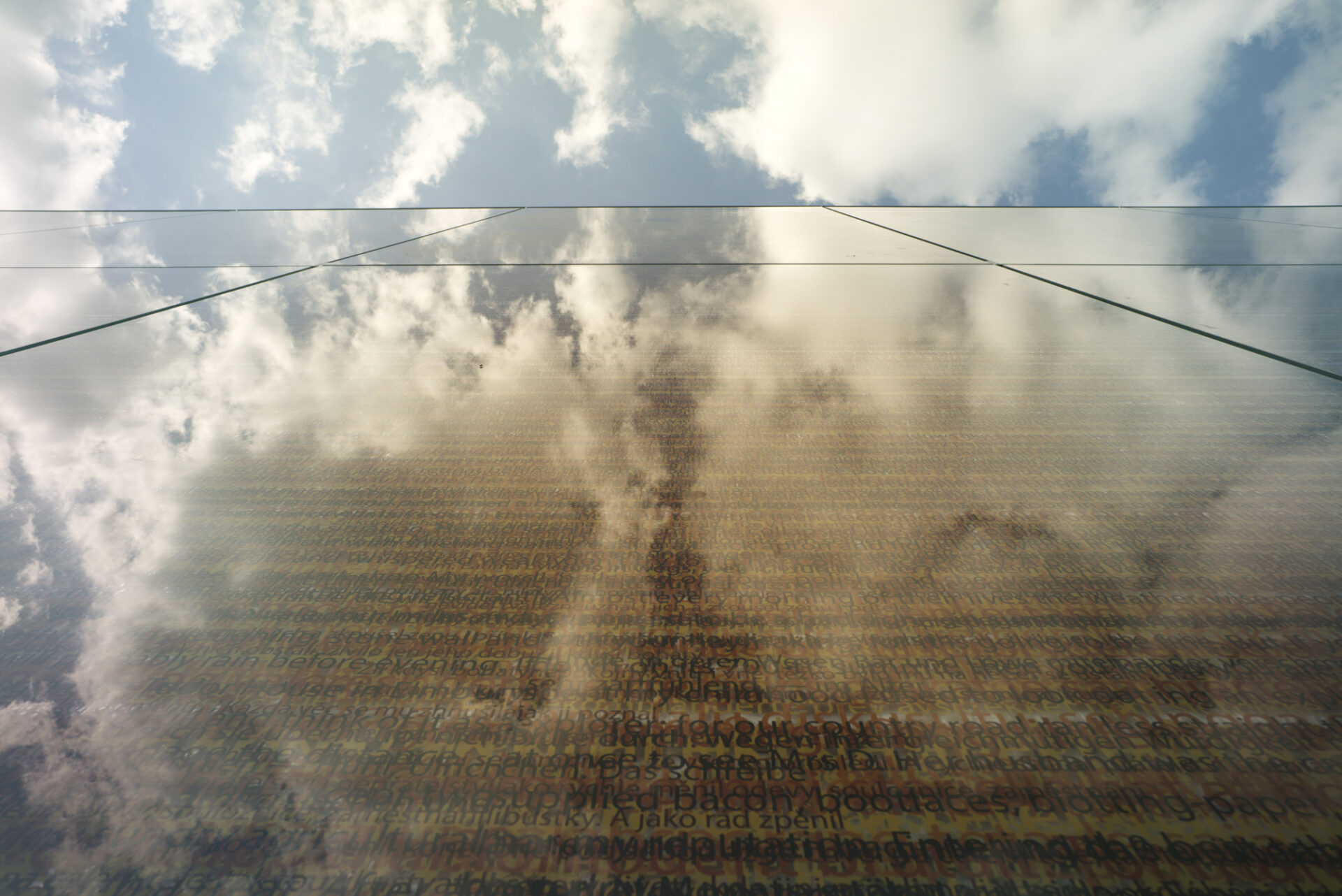
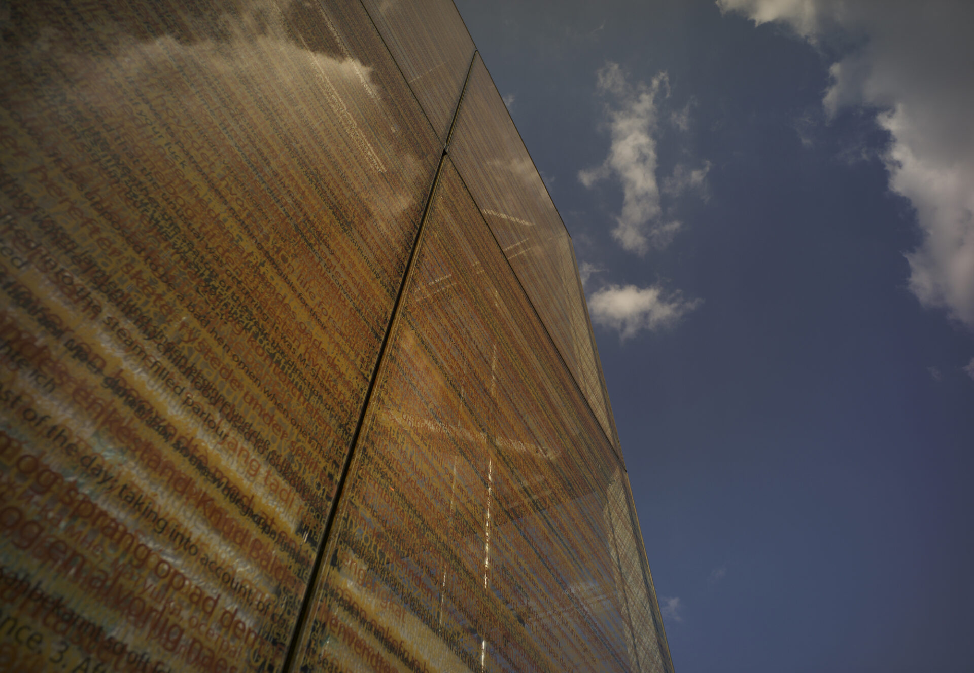
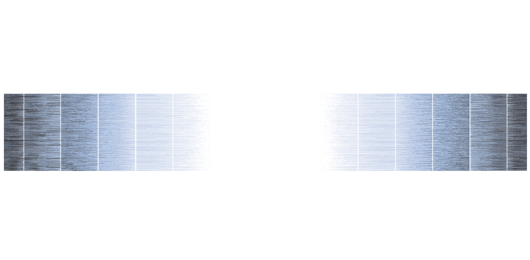
The printed images are made up of multiple strata of coloured text, layers of colour gradations and script formations that form a complex ‘palimpsest’ of data. Up close, fragments of an array of different languages are partially discernible. From a distance, the image reads more like a painting, the lines of text presenting as a shimmering mass of colour. Visual and conceptual references have been found in the origins of documents, papers and writing: Papyrus, Parchment and vellum; the image of the palimpsest where layers of text are present, some semi-effaced, others more prominent; and inks, in particular the introduction of blue ink with its strong associations with academia.
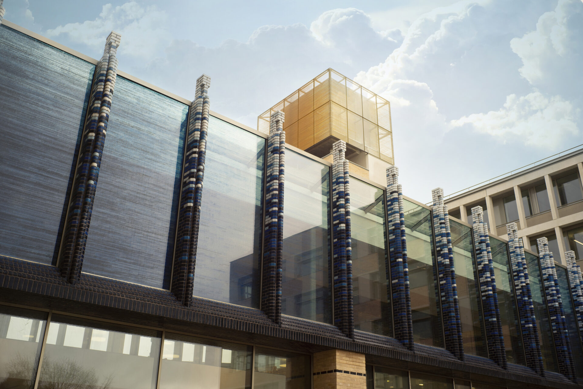
The façade piece is created from many different shades of blue and grey and presents as a deep indigo that is most intense at the edges and fades to nothing as it moves towards the centre, creating a central ‘void’ where no image is present.
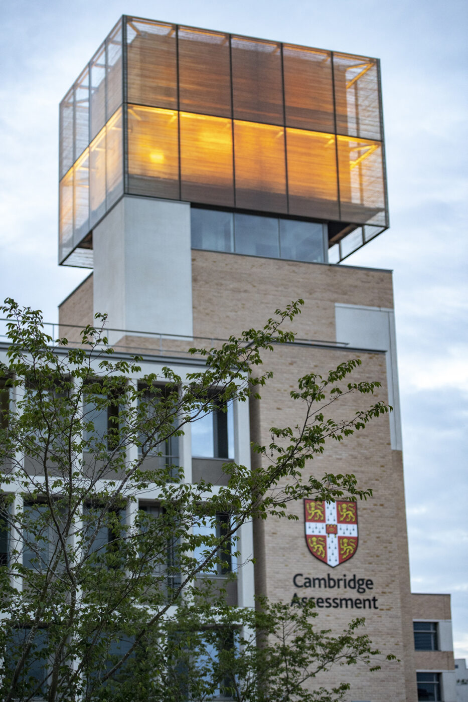
The tower piece covers all four glazed faces of the tower; two of the faces will house a central ‘void’ where the layers of text fade to nothing, reminiscent of the façade, and the other two faces will show a full surface of dense text in a deep saffron colour.
The text data that forms the body of the two images is gathered from a combination of sources:
Individuals were asked to respond to a ‘core’ question: ‘what does knowledge mean to you?’
The collected data reflects the trans-national and trans-cultural nature of the work and ethos of Cambridge Assessment. The aspiration was to include all written languages of the world so that they entwine into a collective unified image.
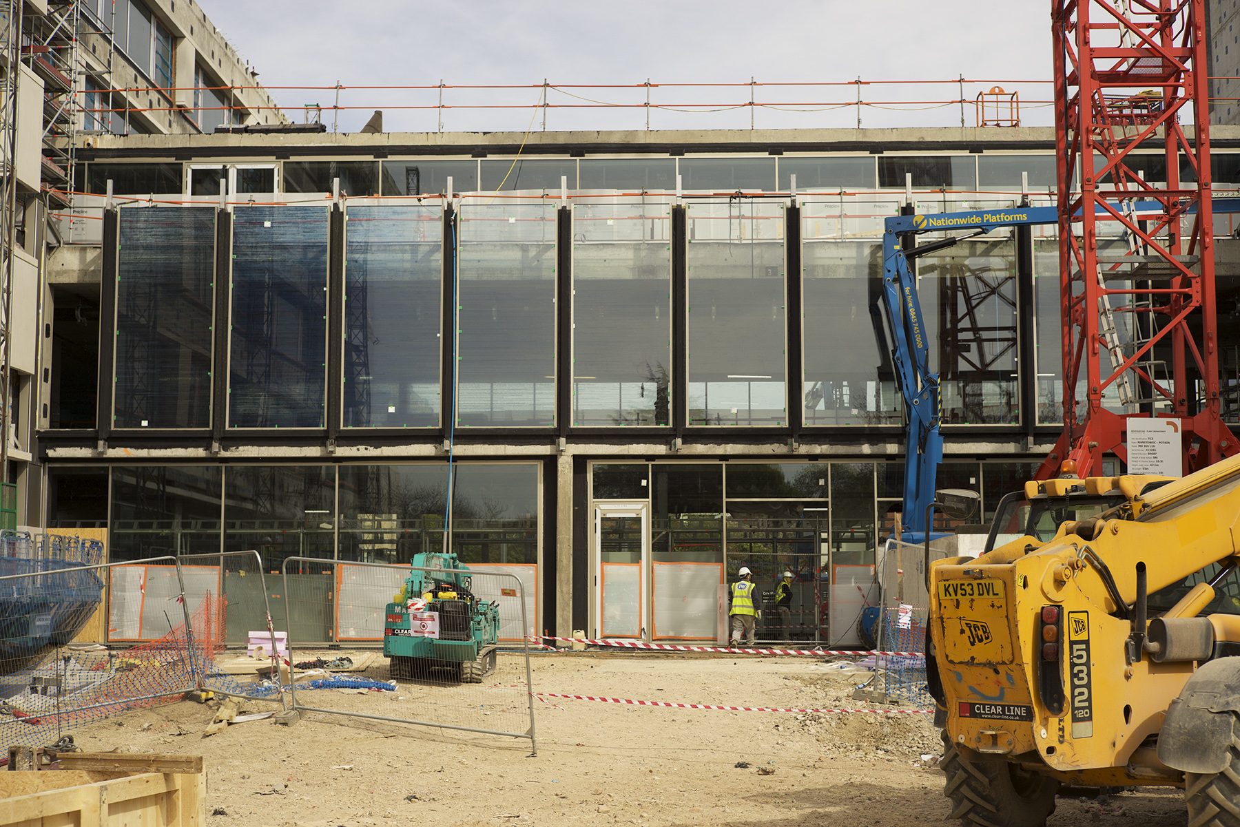
The art work also encompasses the brick fins on the façade of the building. Through a collaborative process with Eric Parry Architects the printed glass works are ‘woven’ into the fabric of the building. The same palette of blues used for the printed glass was used to create a ceramic glaze for the bricks for the fins. Each fin has a unique colour scheme composed from this core palette: starting with the darkest indigos at the bottom where the fins emerge from the ‘bridge’ and fading up to the palest greys and blues at the summit of the fins. The darkest indigo blue bricks are integrated below the fins to create a deep inky blue ‘portico’ under which staff and visitors pass to enter the building.